Model-driven form with Angular FormBuilder
Model-driven form with Angular FormBuilder
Few weeks ago I explained how we could build reactive forms with Angular. In the previous post, I emphasized on how the reactiveness was enabling us to susbscribe to the state and “react” to any state changes. Since then I have been playing quite a bit with the reactive form and more precisely with the FormBuilder. I ended up being more impressed by the link between FormGroup and UI rendering rather than about the reactiveness nature of the state held by the form. So today I would like to expand more on the FormBuilder by showing the steps needed to build a more complicated form supporting arrays of arrays and different controls like date picker and color picker. This post will be composed by 3 parts:
1. Building the metadata element form
2. Building the array sections
3. Postback
1. Building the metadata element
We start with a model which I just made up this model so there is no particular meaning in it.
interface Model {
  name: string;
  color: string;
  validity: Date;
  range: number[];
  choice: string;
  sections: {
    sectionName: string;
    keywords: { keyword: string }[];
  }[];
}
What is interesting is that it contains a range, a color, a date and arrays of arrays.
We start first by building the metadata
name: string;
color: string;
validity: Date;
range: number[];
choice: string;
For the name we will use a simple html text input but for the rest, in order to provide the best user experience, we can make use of PrimeNg components:
- for the color we will be importing the
ColorPickerModule, - for the validity date we will be importing the
CalendarModule, - for the range we will be importing the
SliderModule, - lastly for the choice we will be importing the
DropdownModule.
import { CalendarModule, ColorPickerModule, DropdownModule, SliderModule } from 'primeng/primeng';

@NgModule({
  imports: [
    BrowserModule,
    BrowserAnimationsModule,
    CalendarModule,
    ColorPickerModule,
    DropdownModule,
    SliderModule
  ],
  declarations: [
    ComplexComponent,
  ]
})
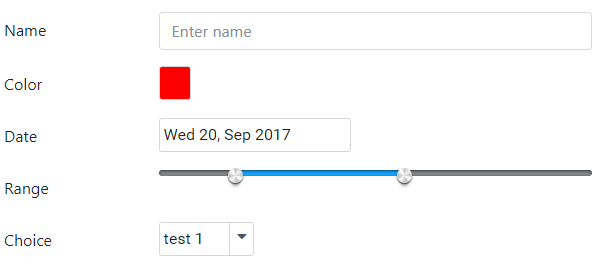
1.1 Text input
We start first by the basic:
- define the form
- define the simplest element, the name text input
<div class="p-3">
    <form [formGroup]="form">
        <div class="form-group row">
            <label for="name" class="col-sm-3 col-form-label">Name</label>
            <div class="col-sm-9">
            <input id="name" type="text" class="form-control" formControlName="name" placeholder="Enter name" />
            </div>
        </div>
    </form>
</div>
For the component, we define a FormGroup containing the whole form and we instantiate it using the FormBuilder group() function.
More explanation can be found on my previous blog post on Reactive forms.
export class ComplexComponent implements OnInit {
  form: FormGroup;

  constructor(private fb: FormBuilder) {
  }

  ngOnInit() {
    this.form = this.fb.group({
      name: ['']
    });
  }
}
What is the difference between [formGroup] and formControlName?
The difference resides in what the value is:
[FormGroup]is a binding property, the value passed is theform object,[formGroup]="form"itself containing all the controlsformControlNameis an attribute on the component accepting simple textformControlName="name"here. It is used to access the property within theform object, meaning it will try to accessform.name(or something like that).
1.2 ColorPicker
To add a color picker input, we use the ColoPicker component from PrimeNg.
<div class="p-3">
    <form [formGroup]="form">
        <div class="form-group row">
            <label for="name" class="col-sm-3 col-form-label">Name</label>
            <div class="col-sm-9">
                <input id="name" type="text" class="form-control" formControlName="name" placeholder="Enter name" />
            </div>
        </div>
        <div class="form-group row">
            <label for="color" class="col-sm-3 col-form-label">Color</label>
            <div class="col-sm-9">
                <p-colorPicker formControlName="color"></p-colorPicker>
            </div>
        </div>
    </form>
</div>
ColorPicker works with 2-way bindings with ngModel but notice that it can also be used with formControlName="color" like how we did to fill up the value of a reactive form.
Note that if we forget to add BrowserAnimationsModule we will be presented with the following error:
Found the synthetic property @panelState. Please include either "BrowserAnimationsModule" or "NoopAnimationsModule" in your application.
In the component then we simply need to add it in the instantiation:
this.form = this.fb.group({
    name: [''],
    color: ['']
});
1.3 Calendar
To add a calendar for date input, we use the Calendar component from PrimeNg.
Same as the color picker, we add the calendar for the date by using the formControlName="validity":
<div class="p-3">
    <form [formGroup]="form">
        <div class="form-group row">
            <label for="name" class="col-sm-3 col-form-label">Name</label>
            <div class="col-sm-9">
                <input id="name" type="text" class="form-control" formControlName="name" placeholder="Enter name" />
            </div>
        </div>
        <div class="form-group row">
            <label for="color" class="col-sm-3 col-form-label">Color</label>
            <div class="col-sm-9">
                <p-colorPicker formControlName="color"></p-colorPicker>
            </div>
        </div>
        <div class="form-group row">
            <label for="date" class="col-sm-3 col-form-label">Date</label>
            <div class="col-sm-9">
                <p-calendar formControlName="validity" dateFormat="D d, M yy"></p-calendar>
            </div>
        </div>
    </form>
</div>
We can also specify a dateFormat like here "D d, M yy" will display Wed 13, Sep 2017. The formats can be found on PrimeNg doc:
d - day of month (no leading zero)
dd - day of month (two digit)
o - day of the year (no leading zeros)
oo - day of the year (three digit)
D - day name short
DD - day name long
m - month of year (no leading zero)
mm - month of year (two digit)
M - month name short
MM - month name long
y - year (two digit)
yy - year (four digit)
@ - Unix timestamp (ms since 01/01/1970)
! - Windows ticks (100ns since 01/01/0001)
'...' - literal text
'' - single quote
And similarly as the name and color, we need to instantiate it:
this.form = this.fb.group({
    name: [''],
    color: [''],
    validity: [new Date()]
});
1.4 Range
To add a range input, we use the Slider component from PrimeNg.
Range can be added using p-slider and also work with formControlName="range".
<div class="form-group row">
    <label for="range" class="col-sm-3 col-form-label">Range</label>
    <div class="col-sm-9">
        <p-slider formControlName="range" [range]="true" [min]="0" [max]="1000"></p-slider>
    </div>
</div>
In order to specify that the value is a range; a value composed of two values, we specify [range]="true".
this.form = this.fb.group({
    name: [''],
    color: [''],
    validity: [new Date()],
    range: [[0, 100]]
}
The range being an array of two elements, we can instantiate it with any value here 0 and 100.
1.5 Choice
Lastly for a choice, we use the Dropdown component from PrimeNg.
<div class="form-group row">
    <label for="choice" class="col-sm-3 col-form-label">Choice</label>
    <div class="col-sm-9">
         <p-dropdown [options]="choices" formControlName="choice"></p-dropdown>
    </div>
</div>
The dropdown also support reactive form notation with formControlName="choice". In order to provide the options, we pass an object { label: string; value: any; }, the label is used to display on the selection and the value is the one saved into the form variable.
export class ComplexComponent implements OnInit {
  form: FormGroup;
  choices: {label: string, value: string}[];

  constructor(private fb: FormBuilder) {
  }

  ngOnInit() {
    this.choices = [
      { label: 'test 1', value: 'test-1' },
      { label: 'test 2', value: 'test-2' },
      { label: 'test 3', value: 'test-3' },
      { label: 'test 4', value: 'test-4' }
    ];

    this.form = this.fb.group({
      name: [''],
      color: [''],
      validity: [new Date()],
      range: [[0, 100]],
      choice: [this.choices[0].value]
    });
  }
}
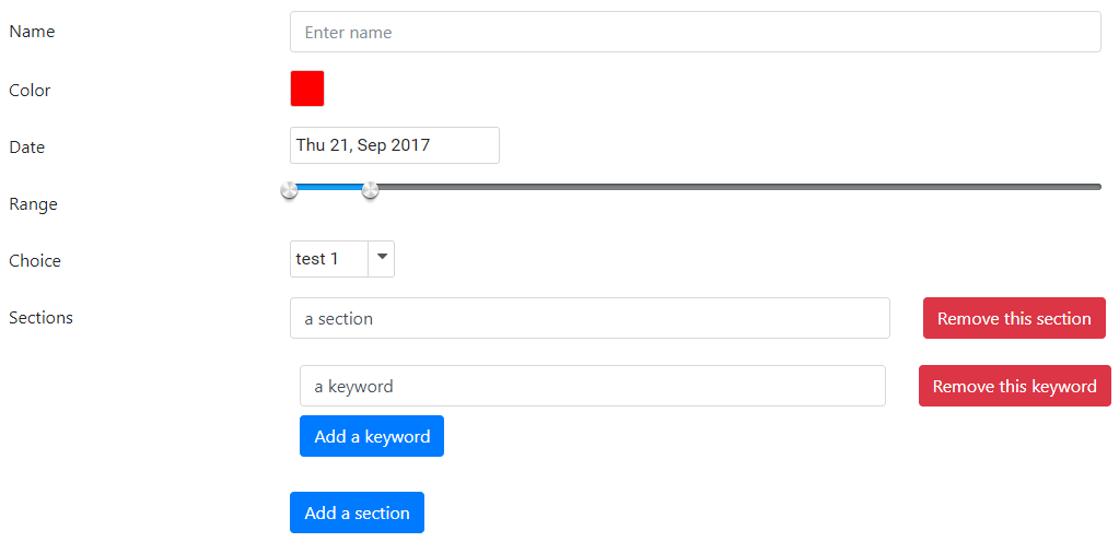
Now that we saw how to build common elements, we can move on to build the array sections.
2. Building the array sections
Let’s start first by looking at the template of a form array:
<div class="form-group row">
    <label class="col-sm-3 col-form-label">Sections</label>
    <div class="col-sm-9" formArrayName="sections">
        <div *ngFor="let section of sections.controls; index as i" [formGroupName]="i">
            <input id="{{ 'sectionName-' + i }}" type="text" class="form-control" formControlName="sectionName" placeholder="Enter section name" />
        </div>
    </div>
</div>
As discussed in (1), formArrayName takes a string which points to the property name of the array on the form object passed to the FormGroup.
We then iterate over the sections.controls and set the [FormGroupName]="i". Every elements in the section array is a FormGroup which we need to select to display. The selection is done using the index of the section in the array and setting it to FormGroupName. Because it is a variable which need to be bound, we need to write it in the binding format [FormGroupName]="i".
Then once we have bound the form group array element, what is contained within it is targeting the array element itself. Therefore we can use formControlName to target the property of the particular element formControlName="sectionName". This will result in the control displaying form.sections[0].sectionName for:
[FormGroup]="form"
=> formArrayName="sections"
=> [formGroupName]="i" (where i=0 for first element)
=> formControlName="sectionName"

==> form.sections[0].sectionName
There is a catch though, we must not forget to define sections in *ngFor="let section of sections.controls; index as i".
sections is a variable in our component which we need to declare and which needs to point to the array within the form. We do so by added a getter and getting the sections property of the form:
get sections() {
    return this.form.get('sections');
}
Lastly we can instantiate the sections using the array() function of the FormBuilder:
this.form = this.fb.group({
    name: [''],
    color: [''],
    validity: [new Date()],
    range: [[0, 100]],
    choice: [this.choices[0].value],
    sections: this.fb.array([
        this.fb.group({
            sectionName: ['']
        })
    ])
});
Now what is intereting about an array is that we can add and remove item from it. It is a collection of multiple elements. To do that we start by adding two function in our component:
addSection() {
    this.sections.push(
        this.fb.group({
            sectionName: ['']
        })
    );
}

removeSection(i) {
    this.sections.removeAt(i);
}
Then we can change our array template to include two more buttons, one to add and one to remove on each element:
<div class="col-sm-9" formArrayName="sections">
    <div class="row mb-2" *ngFor="let section of sections.controls; index as i;" [formGroupName]="i">
        <div class="col-sm-9">
            <input id="{{ 'sectionName-' + i }}" type="text" class="form-control" formControlName="sectionName" placeholder="Enter section name" />
        </div>
        <div class="col-sm-3">
            <button class="btn btn-danger" (click)="removeSection(i)">Remove</button>
        </div>
    </div>
    <button class="btn btn-primary" (click)="addSection()">Add a section</button>
</div>
We now support the array. For the inner array, we can apply the exact same way starting by adding the accessor function to the keyword array:
getKeywords(sectionIndex) {
    return this.sections.controls[sectionIndex].get('keywords') as FormArray;
}
We need to make sure that we get the controls which is an array of FormGroup then select the right index and get the keywords property.
Then we just need the functions to add and remove keywords from a specific section:
addSectionKeyword(sectionIndex) {
    this.getKeywords(sectionIndex).push(
        this.fb.group({
            keyword: ['']
        })
    );
}

removeSectionKeyword(sectionIndex, keywordIndex) {
    this.getKeywords(sectionIndex).removeAt(keywordIndex);
}
Lastly we add the sub-section handling the inner array:
<div class="form-group row">
    <label class="col-sm-3 col-form-label">Sections</label>
    <div class="col-sm-9" formArrayName="sections">
        <div class="row mb-2" *ngFor="let section of sections.controls; index as i;" [formGroupName]="i">
            <div class="col-sm-9">
                <input id="{{ 'sectionName-' + i }}" type="text" class="form-control" formControlName="sectionName" placeholder="Enter section name" />
            </div>
            <div class="col-sm-3">
                <button class="btn btn-danger" (click)="removeSection(i)">Remove this section</button>
            </div>
            <div class="col-12 p-3" formArrayName="keywords">
                <div class="m-2">
                    <div class="row mb-2" *ngFor="let keyword of getKeywords(i).controls; index as j" [formGroupName]="j">
                    <div class="col-sm-9">
                        <input id="{{ 'keyword-' + i + '-' + j }}" type="text" class="form-control" formControlName="keyword" placeholder="Enter section name" />
                    </div>
                    <div class="col-sm-3">
                        <button class="btn btn-danger" (click)="removeSectionKeyword(i, j)">Remove this keyword</button>
                    </div>
                    </div>
                    <button class="btn btn-primary" (click)="addSectionKeyword(i)">Add a keyword</button>
                </div>
            </div>
        </div>
        <button class="btn btn-primary" (click)="addSection()">Add a section</button>
    </div>
</div>
We added the formArrayName="keywords" and handled everything exactly the same way as for the sections. We now have the following:
[FormGroup]="form"
=> formArrayName="sections"
=> [formGroupName]="i" (where i=0 for first element)
=> formControlName="sectionName"

==> form.sections[0].sectionName

==> formArrayName="keywords" (targets form.sections[0].keywords)
==> form.sections[0].keywords
==> [formGroupName]="j" (because 'i' is used for sections)
==> formControlName="keyword"
3. Postback
Submitting data is easy. We use the ngSubmit directive with a submit button.
Then we can handle the data and send it to our server or whatever we wish to do.
<form [formGroup]="form" (ngSubmit)="save()">
    ...
    <button class="btn btn-primary" type="submit">Submit</button>
</form>
And in the component we implement save():
save() {
    console.log(this.form.value);
}
And we are done, we have completed our form with multiple inputs of different type and arrays of arrays.
Conclusion
Today we saw how to use different components from PrimeNg with the Angular FormBuilder to build quickly a form which can handle most of the scenarios, with date, color, selection, range and arrays. The model-driven (also known as reactive form) is extremely easy to use as it is directly bound to a model form within the component. Every directive created to render the UI is straight forward to use if we understand properly what they are and how they are meant to be used. Hope you like this post, if you have any question leave it here or hit me on Twitter @Kimserey_Lam, see you next time!

Comments
Post a Comment