Prime NG data table for Angular
Prime NG data table for Angular
In every web application there is a need to display data in a tabular form. If the amount of data is small, a simple combination of HTML with Bootstrap is enough. But when the data is large, or more advanced functionalities are needed like sort or pagination, a more elaborated table needs to be used. If you followed me, you must have noticed that I am a huge fan of Prime NG and once again, Prime NG saves us the burden of implementing a complex data table by providing an Angular component fully featured. Today we will see how to use it in 3 parts:
1. Use Prime NG data table
2. Customized cell template
3. Pagination
All the source code for this example is available on my GitHub.
1. Use Prime NG data table
1.1 Basic usage
Start by installing Prime NG.
npm install primeng --save
Then in your main app module, register the DataTableModule to get access to its components.
@NgModule({
  imports: [
    ... other imports
    DataTableModule
  ],
  ... other configurations
})
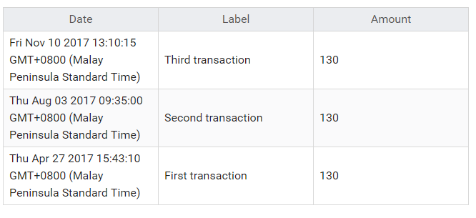
Now that we have imported the module from Prime NG, we can use the data table component and display a list of transactions.
import { Component, OnInit } from '@angular/core';

@Component({
  template: `
    <p-dataTable [value]="transactions">
      <p-column field="date" header="Date"></p-column>
      <p-column field="label" header="Label"></p-column>
      <p-column field="amount" header="Amount"></p-column>
    </p-dataTable>
  `
})
export class DataTableComponent implements OnInit {
  transactions: {
    date: Date,
    label: string,
    amount: number
  }[];

  ngOnInit() {
    this.transactions = [
      {
        date: new Date(2017, 10, 10, 13, 10, 15),
        label: 'Third transaction',
        amount: 130
      },
      {
        date: new Date(2017, 7, 3, 9, 35, 0),
        label: 'Second transaction',
        amount: 130
      },
      {
        date: new Date(2017, 3, 27, 15, 43, 10),
        label: 'First transaction',
        amount: 130
      }
    ];
  }
}
Each p-column directives specify the field to show on the table and the header of the column.
<p-column field="date" header="Date"></p-column>
As we see here, displaying data is made extremely easy. But what if we need more features like sorting and filtering?
1.2 Sort
In order to provide sorting, all we need to do is define which column is sortable by using the sortable input:
<p-column field="date" header="Date" [sortable]="true"></p-column>
Doing that on all columns will make the whole table sortable:
The column on which the sort is applied can be also set directly on the data table using sortField and the order can bbe set using sortOrder.
<p-dataTable [value]="transactions" [sortField]="sortField" [sortOrder]="sortOrder" #dt>
    <p-column field="date" header="Date"></p-column>
    <p-column field="label" header="Label"></p-column>
    <p-column field="amount" header="Amount"></p-column>
</p-dataTable>
This allows us to play around in the component by allowing the sortField to be set from a function or a button click handler.
1.3 Filter
In order to provide filtering, all w eneed to do is to add filter on a column:
<p-column field="date" header="Date" [filter]="true" [sortable]="true"></p-column>
The default filtering is a text filtering. It is also possible to define custom filters which we will see next.
2. Customized cell template
2.1 Body customization
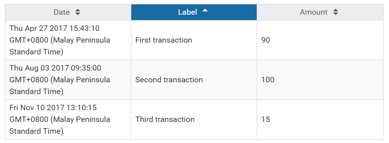
When we display the table, we can see that the date is displayed using the default string of the date Thu Apr 27 2017 15:43:10 GMT+0800 (Malay Peninsula Standard Time).
In order to make it nicer to read, we can customize the cell template using <ng-template></ng-template> and use a library like momentjs to format the date.
We start first by importing moment:
npm install moment --save
import * as moment from 'moment';
Then we create a function to format a date:
format(date) {
  return moment(date).format('lll');
}
Lastly we use the function in a custom cell template for the first column:
<p-column field="date" header="Date" [filter]="true" [sortable]="true">
  <ng-template let-col let-transaction="rowData" pTemplate="body">
      {{format(transaction[col.field])}}
  </ng-template>
</p-column>
Few points to notice here:
let-colis the implicit property which refers to the column. Usingcol.fieldlet you access to the current field defined in<p-column field="xxx">.let-transaction="rowData"sets the data from the current row on atransactionproperty.pTemplatedefines what the custom template is meant for,header,bodyorfilter.
Knowing all this, we can now use transaction[col.field] to get access to the date and pass it to the function we previously created to format the date:
{{format(transaction[col.field])}}
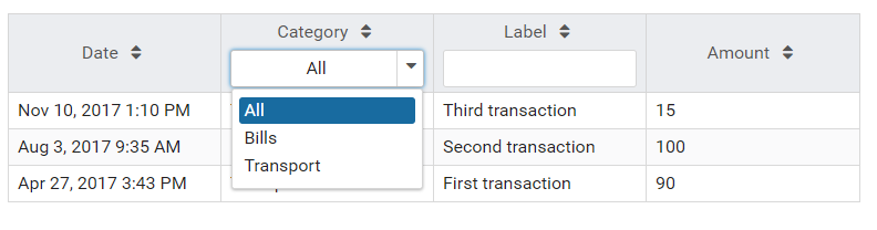
2.2 Filter customization
As we saw, pTemplate is used to define where will the template be used, one of them being the filter.
The default filters being text filters, it is possible to customize the input to have a different filter like a dropdown.
For example let’s add a category property to our transactions which we would like to filter per category:
transactions: {
  date: Date,
  label: string,
  amount: number,
  category: string
}[];
categories: SelectItem[];

ngOnInit() {
  this.transactions = [
    {
      date: new Date(2017, 10, 10, 13, 10, 15),
      label: 'Third transaction',
      amount: 15,
      category: 'Transport'
    },
    {
      date: new Date(2017, 7, 3, 9, 35, 0),
      label: 'Second transaction',
      amount: 100,
      category: 'Bills'
    },
    {
      date: new Date(2017, 3, 27, 15, 43, 10),
      label: 'First transaction',
      amount: 90,
      category: 'Transport'
    }
  ];

  this.categories = [
    { label: 'All', value: null },
    { label: 'Bills', value: 'Bills' },
    { label: 'Transport', value: 'Transport' }
  ];
}
Just like in 2.1, we add a template for the column targeting the category:
<p-column field="category" header="Category" [filter]="true" [sortable]="true" filterMatchMode="equals">
  <ng-template pTemplate="filter">
    <p-dropdown [options]="categories" [style]="{'width':'100%'}" (onChange)="dt.filter($event.value,col.field,col.filterMatchMode)" styleClass="ui-column-filter"></p-dropdown>
  </ng-template>
</p-column>
Notice the following onChange handler:
(onChange)="dt.filter($event.value,col.field,col.filterMatchMode)"
dt is the template variable referencing the data table which we extract with #dt on <p-dataTable #dt>. It gives us access to .filter() which we use by passing the value, the field and the filterMatchMode which is set on <p-column filterMatchMode="equals">. The default filter match mode is startWith, but it can be change to equals, endWith, contains or in.
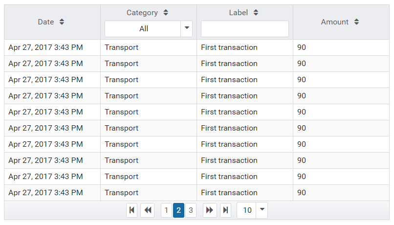
3. Pagination
Another great feature from the data table is the paginator. It is controlled through 3 properties:
rowsdefines the number of rows shown in one page.pageLinksdefines the number of clickable links on the pagination.rowsPerPageOptionsdefines the options to show more or less rows per pages.
Knowing that we can add those to the data table:
<p-dataTable [value]="transactions" [paginator]="true" [rows]="10" [pageLinks]="3" [rowsPerPageOptions]="[5,10,20]" #dt>
</p-dataTable>
Conclusion
Today we saw how to use Prime NG data table. An amazing component for Angular application which makes dealing with data, displaying, filtering, sorting and paginating much easier. In this post, we ran through installing Prime NG on our Angular application, then we saw how to create a basic data table. After that we saw how we could add more complex operations like sorting and filtering and how we could customize the headers and cells templates. Lastly we saw how we could place pagination in. If you have any questions, leave it here or hit me on Twitter @Kimserey_Lam. See you next time!
Comments
Post a Comment